
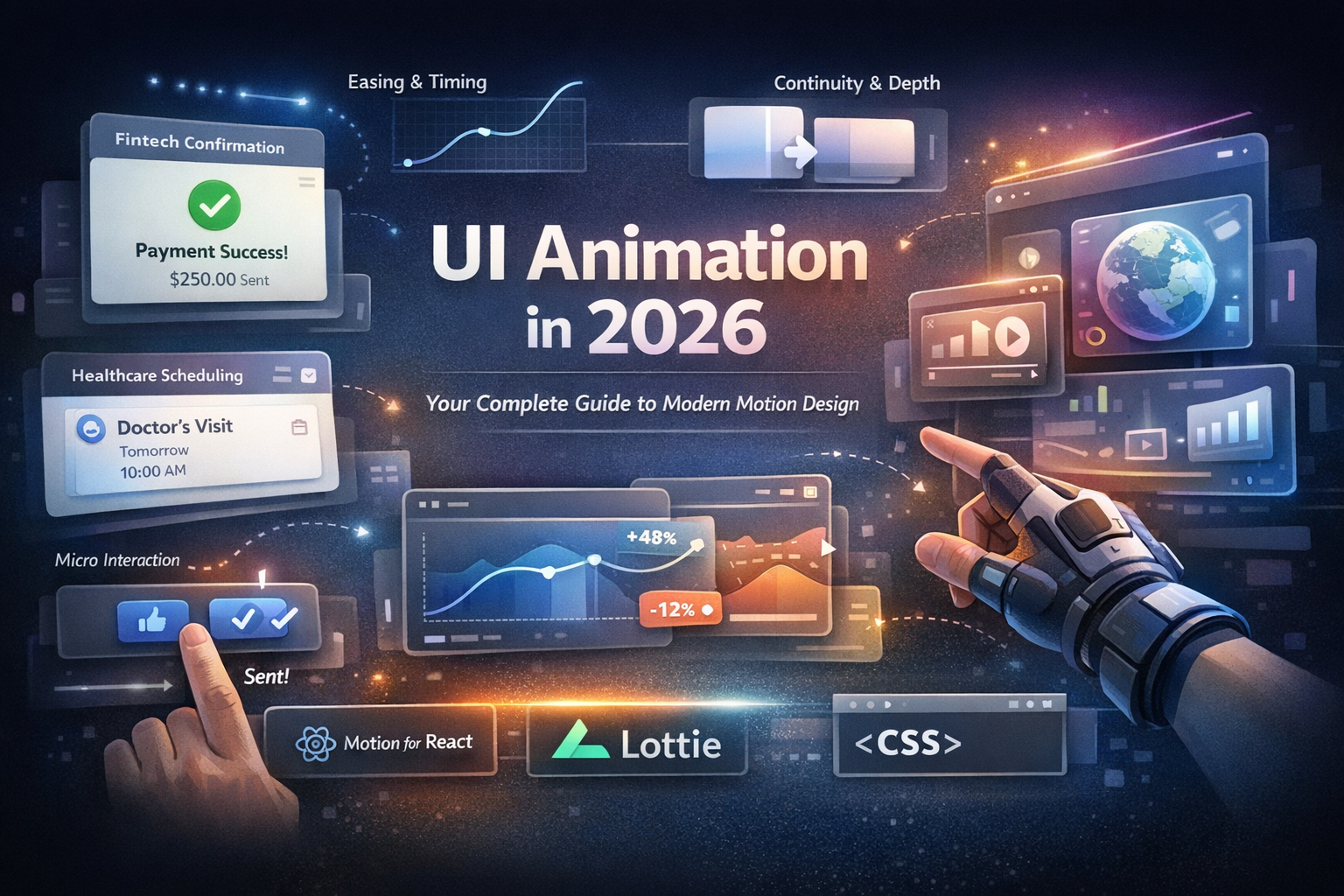
The 2026 UI Animation Guide: Unlocking Motion Design's Future
Screens used to feel like flat pages. You tapped, clicked, and jumped from one state to another with little context in between. That model is fading fast. Modern interfaces use motion to explain cause and effect, preserve context, and help people stay oriented as content changes.
In 2026, the real shift is not simply more animation. It is better motion logic. Product teams are moving beyond flat view swaps and building systems that use continuity, depth, and spatial cues with intent. That matters even more as AR, VR, and spatial interfaces push design beyond the limits of the traditional 2D screen.
In this guide, I break down the foundations of UI animation, the principles that make motion work, the psychology behind it, and the practical shift from 2D UI to spatial UI. I also show how to turn inspiration into production-ready motion specs with tools like CSS, Motion for React, and Lottie. Throughout the guide, I use Ripplix as the reference point because it is built on real product behavior, with 7,000+ product videos, daily updates, coverage across 85+ industries, and a growing AR/VR and spatial UI collection.
Ripplix Video Showcase Placeholder
Static vs. motion, before-and-after examples showing the same UI pattern with and without motion.

Quick Navigation
Who this is for
UI/UX designers, product designers, design system leads, and front-end developers.
What you’ll learn
- Functional motion principles
- Modern animation systems
- Industry-specific motion patterns
- The psychology behind motion
- Spatial UI rules
- Practical implementation paths
How to use this page
Start with the pattern checklists if you want fast takeaways. Then go deeper into the principles, psychology, and implementation sections when you are ready to turn inspiration into a repeatable system.
Chapter 1: The Foundations of Motion
Animation is not decoration anymore
If your product still treats motion like frosting, you are leaving usability on the table. Good UI animation confirms actions, reduces uncertainty, and helps people track change. Strong platform guidance has treated motion this way for years. It works best when it is brief, subtle, and tied to feedback, state changes, navigation, and signifiers.
Motion does four jobs especially well:
- It gives feedback so a press, swipe, or submit action feels acknowledged.
- It preserves continuity so a card expanding into a detail page still feels like the same object.
- It creates hierarchy so the next important element gets visual priority.
- It teaches affordance so interactive things feel alive enough to invite action.
When those jobs are missing, products feel abrupt, brittle, and harder to trust.
The functional jobs motion must do
Think of UI animation as a job board, not an art board.
Confirm: “Your action worked”
- Button press feedback
- Optimistic save states
- Sent confirmations
- Biometric success states
Guide: “Look here next”
- Inline validation
- Step transitions
- Focus shifts
- Highlighted next actions
Explain: “This moved because you did that”
- Shared element transitions
- Drawer reveals
- Expanding filters
- Tab underlines that move with intent
Smooth: “This change is safe and expected”
- Content loading
- Data refresh
- List reordering
- Sync recovery
- Offline to online state changes
This is why micro interactions matter so much. They are small, single-purpose interactions that communicate system status, prevent errors, and reinforce brand. That is not a side detail. That is the core of product feel.
The motion stack, from micro to macro
You need different motion rules at different layers of the product.
Micro-interactions
- Toggles
- Hover states
- Pressed states
- Inline validation
- Sliders
- Drag handles
Component transitions
- Cards
- Accordions
- Drawers
- Tabs
- Modals
- Toasts
- Chip selectors
Navigation and flow transitions
- Screen changes
- Route transitions
- Stepper flows
- Drill-down navigation
System motion
- Loading
- Syncing
- Reconnecting
- Retry logic
- Progress
- Empty states
- Error recovery
This stack matters because motion failures scale. A bad hover state is annoying. A bad route transition breaks context. A bad loading state makes the whole product feel unstable. The strongest teams design motion at all four levels, not only the flashy ones.
Ripplix Video Showcase Placeholder
Show the same pattern across four levels: button feedback, modal transition, navigation transition, and loading state.
Motion constraints you cannot ignore
The first blind spot in motion-heavy products is performance. Animation that drops frames or triggers heavy layout work stops being helpful and starts feeling broken.
The second blind spot is accessibility. Reduced-motion support is not optional. If motion can distract users or make them physically uncomfortable, it needs a safe fallback.
The third blind spot is clarity. Motion should never hide information, delay critical tasks, or create mystery in high-risk flows.
The fourth blind spot is consistency. If one part of your product feels crisp and precise while another feels bouncy and playful, the experience starts to feel stitched together instead of intentionally designed.
Warning
Motion should support the task. The moment it becomes a performance, it starts hurting the product.
Chapter 2: The 12 Principles of UI Animation, Reframed for Product Teams
I am not going to treat the old animation canon like museum theory. In product design, every principle should solve a real interaction problem.
1. Easing: the feel of motion
What it solves: It tells users how a transition should feel.
When to use it: Always. Easing is not optional.
Use ease-out for entrances when you want a controlled landing. Use ease-in for exits when something should move out of the way. Use springs for interactive feedback, shared elements, and object-like movement.
Developer note: Cubic-bezier curves are predictable and easy to document. Springs are better when you want physical response, interruption handling, or natural settling.
Common mistakes
- Using one curve for everything
- Adding bounce in serious products
- Using overshoot in compliance-heavy flows
2. Timing and rhythm: speed with intent
What it solves: It keeps the product readable without feeling slow.
When to use it: Across the entire flow, not as one-off decisions.
Keep feedback fast. Make context shifts slightly longer. A toast should not take as long as a route transition. A checkout flow should not change rhythm from one step to the next.
Common mistakes
- Giving every interaction the same duration
- Using long loading animations as an excuse for slow systems
- Breaking rhythm inside onboarding or checkout
3. Anticipation: signal before change
What it solves: It prepares the eye.
When to use it: Expansions, drag interactions, gesture-driven motion, and spatial reveals.
In UI, anticipation is usually tiny. A tab underline nudges before moving. A card lifts slightly before expanding. A handle resists before dragging.
Common mistake: Overdoing it until the interface feels theatrical.
4. Staging: directing attention
What it solves: It answers one question clearly: Where should I look now?
When to use it: Modals, destructive confirmations, onboarding, error states, and spotlight moments.
Use one hero motion at a time. Dim the background. Apply blur, scale, elevation, or focus isolation to guide attention.
Common mistakes
- Two competing moving elements
- Background loops during critical input
- Aggressive parallax under forms
5. Continuity and persistence: do not break the story
What it solves: It preserves object identity.
When to use it: Card-to-detail flows, list-to-thread views, gallery expansions, dashboard drill-downs, and tab movement.
Shared element transitions are one of the cleanest modern ways to preserve continuity. They help users understand that the object changed state, not identity.
Common mistakes
- Hard cuts between related states
- Remounting everything during change
- Rebuilding hierarchy without signaling the connection
6. Follow-through: motion should not stop like a robot
What it solves: It gives movement a believable ending.
When to use it: Toggles, sliders, chips, drag releases, snackbars, and cards.
Use deceleration and controlled settling. Springs work especially well here because they communicate energy without forcing you to hand-build custom easing for every case.
Common mistakes
- Instant stops
- Too much wobble
- Long settling that slows task flow
7. Secondary action: supporting motion
What it solves: It reinforces the main action.
When to use it: Button icon shifts, success glows, label fades, badge pulses, and selection highlights.
Keep the secondary action smaller, later, or both. The primary action should own the moment.
Common mistake: Letting supporting motion overpower the main action.
8. Overshoot and settle: controlled energy
What it solves: It adds response and delight when appropriate.
When to use it: Playful consumer products, gesture-heavy tools, and low-risk exploration moments.
A small scale overshoot or elastic toggle can work well. But serious products need restraint.
Common mistakes
- Using playful overshoot in fintech confirmations
- Adding bounce to healthcare result screens
- Turning serious moments into entertainment
9. Arcs and paths: movement needs logic
What it solves: It prevents robotic motion.
When to use it: Floating actions, shared elements, context menus, gesture paths, and spatial transitions.
Straight lines work for pure utility motion. But object-like movement often feels more natural with slight arcs or path logic, especially in spatial interfaces where depth and relation matter more.
10. Squash and stretch: the UI version
What it solves: It adds elastic response without cartoon physics.
When to use it: Toggles, cards, chips, counters, and draggable objects.
In modern UI, squash and stretch usually means subtle scale change, shape morph, or spring response.
Common mistake: Using literal cartoon deformation that hurts readability.
11. Spatial consistency: depth and layering
What it solves: It tells users what is above, behind, anchored, or active.
When to use it: Drawers, bottom sheets, stacked cards, tooltips, floating controls, and AR/VR surfaces.
Be clear about:
- Z-order
- Shadow logic
- Elevation changes
- Blur
- Occlusion
If depth has no interaction logic, it will feel fake.
12. Appeal: taste, restraint, and motion language
What it solves: It turns isolated transitions into a product voice.
When to use it: Across the whole system.
Define a motion personality such as:
- Calm
- Precise
- Energetic
- Playful
- Clinical
- Premium
Then encode it into tokens:
- Durations
- Easing families
- Distance rules
- Elevation changes
- Opacity ranges
- Reduced-motion alternatives
Appeal does not come from more effects. It comes from control, repeatability, and fit.
Ripplix Video Showcase Placeholder
Principles in the wild, with one clip per principle and clear annotations.Live Demo Placeholder
Interactive easing playground with cubic-bezier and spring curves on the same UI component.
Chapter 3: Industry-Specific Motion Design Standards
Why industry context changes the rules
This is where weak design advice falls apart. Motion should not work the same way in every product. Trust level, urgency, compliance, emotional tone, and information density all change the right answer.
Fintech feels different from commerce because the level of user risk is different. Healthcare feels different from social media because the emotional and cognitive stakes are different. Motion has to respect the context.
Fintech motion patterns: trust first
In fintech, motion should reduce doubt. Confirmation states should feel calm and final. Verification flows should feel orderly. Progressive disclosure works well for fees, terms, and fraud checks because it reveals complexity without dropping users into a wall of text.
Use
- Inline confirmations
- Step continuity
- Secure state transitions
Avoid
- Playful bounce
- Unclear transformations during money movement
- Flashy success states that feel unserious
Industry motion recipe card: Fintech
- Goal: Trust, clarity, assurance
- Motion intensity: Low
- Timing: Fast feedback, measured context shifts
- Recommended patterns: Inline confirmations, step continuity, secure transitions
- Risks: Bounce, confetti logic, unclear pending states
- Ripplix tags: Fintech, payment confirmation, verification, fraud alert
Ripplix Video Showcase Placeholder
Fintech confirmations, verification flows, and fraud warning states.
E-commerce motion patterns: momentum and conversion
Commerce motion should build confidence while keeping momentum. Add-to-cart feedback needs to confirm success without pulling users out of shopping mode. Variant switching should preserve object identity. Gallery transitions should support comparison. Shipping progress should reduce uncertainty.
Use
- Cart drawer continuity
- Image crossfades
- Stock feedback
- Shipping progress states
Avoid
- Overlong cart transitions
- Distracting hover motion
- Confusing size or color swaps
Industry motion recipe card: E-commerce
- Goal: Speed, confidence, momentum
- Motion intensity: Medium
- Timing: Fast on inputs, moderate on gallery and cart changes
- Recommended patterns: Cart continuity, image crossfades, shipping feedback
- Risks: Long cart transitions, distracting hover effects, confusing variants
- Ripplix tags: Ecommerce, add to cart, gallery, checkout, shipping progress
Ripplix Video Showcase Placeholder
E-commerce cart flows, gallery transitions, and variant switching.
Healthcare motion patterns: clarity and comfort
Healthcare motion needs restraint. Appointment booking, result viewing, reminders, and sensitive alerts all benefit from low cognitive burden and clear transitions. Reduced-motion defaults matter more here because users may already feel stressed or uncomfortable.
Use
- Clear next-step cues
- Visible progress
- Safe confirm and undo states
Avoid
- Abrupt alerts
- Motion-heavy onboarding
- High-energy transitions during sensitive tasks
Industry motion recipe card: Healthcare
- Goal: Clarity, comfort, reassurance
- Motion intensity: Low
- Timing: Short and stable
- Recommended patterns: Next-step cues, progress visibility, safe confirm states
- Risks: Abrupt alerts, heavy onboarding motion, high-energy transitions
- Ripplix tags: Healthcare, booking, patient portal, results, medication reminder
Ripplix Video Showcase Placeholder
Healthcare scheduling, results viewing, and sensitive alert states.
SaaS and B2B dashboards: density without chaos
Dashboards have a different challenge. They carry too much information. Here, motion should work like focus management. Filtering transitions should reveal what changed. Drill-downs should preserve context. Empty states should teach, not just decorate.
Use
- List diffing
- Panel continuity
- Shared elements
- Skeleton-to-content transitions
Avoid
- Too many concurrent motions
- Animated charts with no purpose
- Hidden state changes
Industry motion recipe card: SaaS and B2B
- Goal: Orientation, comprehension, focus
- Motion intensity: Low to medium
- Timing: Fast on data response, moderate on panel changes
- Recommended patterns: List diffing, panel continuity, shared elements
- Risks: Competing motion, purposeless chart animation, hidden changes
- Ripplix tags: SaaS, dashboard, analytics, filters, drill-down
Ripplix Video Showcase Placeholder
SaaS filters, panel transitions, and drill-down continuity.
Media, social, and entertainment: tempo and personality
These products can carry more energy because discovery, reaction, expression, and browsing are part of the value. Gesture-driven motion, layered media transitions, expressive onboarding, and richer reactions can all work here.
The trap is obvious. Content still has to win. Good motion supports the scroll, the view, the reaction, the post, and the share. Bad motion competes with all of them.
Pro Tip
The right motion style depends less on aesthetics and more on user risk. The higher the risk, the lower the motion intensity should be.
Chapter 4: The Psychology of User Interaction
Motion as attention design
Users should not need to reread the entire screen to figure out what changed. Motion can mark change instantly. It creates a visual path through complex UI, which lowers the mental effort required to understand state, hierarchy, and consequence.
Motion helps when it supports comprehension. It hurts when it steals attention without earning it.
Cognitive load reducers you can design on purpose
There are three reliable ways to use motion to reduce cognitive load.
1. Progressive disclosure with animated reveals
Show the next layer only when it matters.
2. Clear cause-and-effect transitions
Let the interface answer the question: This happened because you did that.
3. Feedback loops that remove uncertainty
Use clear motion for states like:
- Pressed
- Saving
- Validating
- Synced
- Failed
- Retried
- Complete
This is where motion often beats static design in dense flows. A filter panel that updates results smoothly creates more confidence than a full page jump. A card that expands into detail teaches relationship better than a hard route cut.
Error prevention and recovery
Motion can stop mistakes before they happen.
It can:
- Prevent double taps through press feedback
- Catch bad inputs through well-timed validation
- Make undo states feel safe
- Keep users informed during loading or sync delays
- Prevent frozen-screen confusion with visible progress
Ripplix Video Showcase Placeholder
Error states done right, including validation, retry, undo, and offline sync.
Measuring whether motion is helping
Do not judge motion by taste alone. Measure it.
Key metrics to track:
- Task completion rate
- Error rate
- Time to comprehension
- Drop-off in key flows
- Misclick rate
- Retry rate
The best testing model is not motion versus no motion. That is too blunt. A better question is this: Which level and type of motion helps this flow most?
Chapter 5: Transitioning to Spatial UI
Ripplix Video Showcase Placeholder
Best-of spatial UI motion patterns across AR, VR, and mixed reality.
What changes in 3D, and why 2D instincts break
Here is the hard truth. Many 2D motion instincts fail in spatial computing.
On a flat screen, motion mainly supports orientation and feedback. In spatial interfaces, motion also affects comfort. Depth cues, parallax, occlusion, and stable anchoring become functional tools. Poor movement is not only confusing. It can also be physically uncomfortable.
Input changes too. You are no longer designing only for taps. Gaze, hands, controllers, dwell, and voice all reshape when and how motion should respond. A floating menu that feels fine on a phone can feel loose, tiring, or disorienting in space.
Spatial motion principles: practical rules
Spatial anchoring
Keep UI attached to a stable reference. Floating without logic creates drift and uncertainty.
World-locked versus head-locked UI
Choose carefully. World-locked UI supports place and memory. Head-locked UI supports persistent access, but too much of it feels intrusive.
Depth and scale continuity
Avoid sudden jumps in size or distance. If something comes forward, it should do so with a readable path and a clear purpose.
Comfort-first movement
Reduce abrupt camera-like motion. Let the environment stay stable whenever possible.
Focus guidance
Guide attention toward the next target, but do not yank users across depth planes.
Core spatial UI patterns
- 2D panel to volumetric card for adding depth without creating a full scene shift
- Object-focused transitions for zooming into an object in space
- Spatial menus that appear near the task instead of randomly in view
- Depth-aware notifications that are visible without breaking focus
- Gesture onboarding through motion instead of long written instructions
2D to spatial translation checklist
- Identify what must remain stable
- Choose your depth strategy: layers or volumes
- Define the input model: gaze, pinch, drag, dwell, or voice
- Define comfort constraints
- Define fallback behavior for non-spatial contexts
Ripplix Video Showcase Placeholder
The same task shown in 2D and in spatial UI with different motion logic.Pro Tip
In spatial design, stable placement matters more than spectacle. Comfort is a product feature.
Chapter 6: Implementation and Tech Stack
Choosing the right tool for the job
CSS animations
Use CSS for:
- Simple feedback
- Hover states
- Lightweight transitions
- Tokenized component motion
- Design system basics
CSS is easy to ship and easy to audit. But once you need orchestration, interruption handling, shared element transitions, or complex state logic, it becomes harder to manage cleanly.
Motion for React
Use Motion when you need:
- Component-based animation
- Layout-aware transitions
- Springs
- Gestures
- Shared elements
Its layout and layoutId model works especially well for accordions, route transitions, tab indicators, filtering, and object continuity.
Lottie
Use Lottie for:
- Rich branded moments
- Illustration-led onboarding
- Celebratory moments
- Cross-platform vector animation
Lottie is not a free pass. File size, runtime cost, and theming still matter.
Ripplix-to-build workflow: the blueprint method
This is the workflow I would hand to a real product team.
Step 1: Pick a Ripplix reference clip and define the UI goal
Do not say, “Make it cool.” Define the job clearly.
Examples:
- Confirm add to cart
- Preserve filter context
- Reduce perceived wait
- Teach a gesture
Step 2: Break it into beats
Map the sequence:
- Start state
- Transition trigger
- Travel path
- Settle
- Post-state
Step 3: Extract motion tokens
Capture:
- Duration
- Easing
- Distance
- Opacity
- Scale
- Elevation
- Blur
- Delay
- Reduced-motion fallback
Step 4: Map it to components
Tie the motion to actual design system parts:
- Button
- Card
- Modal
- Route
- Chart
- Dropdown
- Sheet
- Tooltip
Step 5: Implement and QA across devices
Test:
- Low-end hardware
- Fixed containers
- Scroll contexts
- Touch states
- Keyboard states
Step 6: Add reduced-motion alternatives
This should be production-ready, not an afterthought.
Live Demo Placeholder
Pick a Ripplix clip and auto-generate a motion spec checklist with durations, easing suggestions, and component mapping.
Performance and accessibility checklist
- Respect reduced-motion settings
- Avoid motion patterns that can trigger nausea or distraction
- Prefer transforms and opacity over layout-heavy animation
- Test on low-end devices
- Avoid reflow storms
- Keep loading motion informative, not endless
- QA inside scrollable and fixed containers
Team handoff kit: designer to developer
A professional handoff should include:
- Motion spec sheet with tokens
- Approved easing families
- Duration ranges by component type
- Reference clips from Ripplix
- Component mapping to design system parts
- Reduced-motion alternatives
- QA test cases for press, hover, focus, error, loading, and state change
This is where many teams either mature or stall. Inspiration without a spec turns into subjective debate. A motion system turns taste into repeatable decisions.
Example Motion for React snippet
import { motion } from "framer-motion";

export function ExpandingCard({ isOpen }) {
  return (
    <motion.div
      layout
      initial={false}
      animate={{
        borderRadius: isOpen ? 24 : 16,
        scale: isOpen ? 1 : 0.98
      }}
      transition={{
        type: "spring",
        stiffness: 320,
        damping: 30
      }}
      className="card"
    >
      {isOpen ? "Expanded content" : "Collapsed content"}
    </motion.div>
  );
}
Warning
A nice animation library will not save weak motion logic. The logic comes first. The tool comes second.
Bonus Section: A Motion System You Can Scale
Motion maturity model for teams
Level 1: Ad hoc motion
Random durations, copied effects, one-off behavior.
Level 2: Consistent durations and easing
You have recognizable defaults.
Level 3: Component-based motion library
Buttons, modals, drawers, tabs, lists, and route transitions follow system rules.
Level 4: Measured motion tied to product metrics
You test and adjust motion based on user behavior.
Level 5: Multi-platform motion system, including spatial UI
The same logic extends from web and mobile into AR, VR, and spatial interfaces.
The best products are not the loudest. They are the most consistent. Their motion language stays stable even as the interface changes.
Ripplix Video Showcase Placeholder
Motion systems in real products, grouped by pattern consistency.
Motion tokens and governance
A scalable motion system needs tokens for:
- Duration
- Easing
- Distance
- Opacity
- Elevation
- Reduction rules
It also needs governance. Motion QA should be part of:
- Design review
- Component review
- Release review
That is how motion stops being subjective decoration and becomes reliable system behavior.
FAQs
What is UI animation, and how is it different from motion graphics?
UI animation is functional motion inside an interface. It helps users understand feedback, state change, hierarchy, and navigation. Motion graphics are usually precomposed visuals used for storytelling or branding.
Takeaway: If the motion changes how a user understands or operates the product, it is UI animation.
How do I choose the right easing for product UI?
Start with intent. Use ease-out for entrances, ease-in for exits, and springs for interactive, object-like movement.
Takeaway: Build a small easing set and assign each curve a clear job instead of letting everyone choose randomly.
When does animation hurt usability?
Animation hurts usability when it delays tasks, distracts from content, breaks focus, hides information, or causes discomfort. It also hurts when users cannot reduce or disable nonessential motion.
Takeaway: Audit every animation with one question: does it confirm, guide, explain, or smooth? If it does none of those, cut it.
What are the best UI animation tools for developers in 2026?
CSS is best for lightweight system motion. Motion for React is strong for component transitions, springs, layout changes, and shared elements. Lottie works well for rich vector-based branded moments.
Takeaway: Choose the simplest tool that still fits the interaction logic.
How do I adapt 2D UI motion rules for spatial interfaces?
Keep stable anchors, reduce abrupt movement, use depth with purpose, and design for comfort first.
Takeaway: Before animating anything in space, define what must stay stable in the user’s field of view and how input works.
How do I audit motion in an existing product?
Review each flow for:
- Feedback
- Continuity
- Hierarchy
- Accessibility
- Performance
- Consistency
Then test reduced-motion states and measure completion, error, and drop-off changes.
Takeaway: Audit by component and by journey. You need both views to spot local problems and system-level drift.
Ripplix Video Showcase Placeholder
FAQ examples, with one clip per question mapped to the answer.
Conclusion: Build Better Motion Faster
Motion is no longer a nice extra. It is a functional layer that helps people understand, trust, and enjoy your product. The strongest products use motion to clarify cause and effect, preserve continuity, guide attention, and reduce cognitive load.
If you want to move from random “cool animations” to professional motion standards, stop guessing. Start with real product references. Extract the logic. Turn it into tokens. Build with a repeatable workflow.
That is why Ripplix matters. It gives you a blueprint library built on real product behavior, not abstract opinion.
Explore 7,000+ real UI animations on Ripplix for free and use them as your blueprint for cleaner interactions, smoother flows, and spatial-ready interfaces.