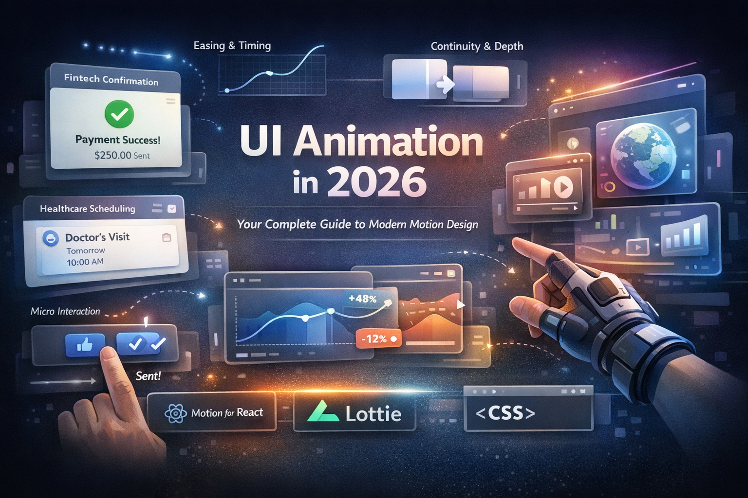

Want to take a gorgeous Dribbble animation and ship it in a real product—without losing the magic or the performance? This guide provides a clear, step-by-step path for designers and front-end developers to follow.
Why Bring Dribbble Animation Into Your Product?
- Boost Engagement: Well-timed motion turns passive views into active taps and swipes.
- Reduce Friction: Microinteractions explain what just happened and what comes next.
- Build Brand Memory: A signature motion language becomes a core part of your identity.
The "Delight" Factor: Imagine a user finishes checkout. Instead of a flat "Success" message, a quick confetti shimmer and a checkmark pop says, "You nailed it." It’s a tiny detail, but it’s what brings people back.
Phase 1: Strategy & Selection
Step 1: Pick the Right Shot (Feasibility Triage)
Evaluate your animation candidates against these four criteria:
- Sequence Length: Is it a quick state change (200–600ms) or a cinematic scene?
- Layer Count: Can you isolate shapes? Lottie needs vectors, not flattened videos.
- States & Loops: Will it loop seamlessly? Are intermediate states defined?
- Brand Fit: Does the motion feel like your brand—or a passing trend?
Step 2: Turn "Vibes" into Variables
Create a 5-line motion spec for every animation:
- Trigger: What starts it? (Tap, Load, Success)
- Intent: What should the user learn or feel?
- Duration: Total time in milliseconds (e.g., 320ms).
- Curve: The easing style (e.g., standard or custom bezier).
- States: Start → Middle → End.
Timing Category | Duration | Use CaseInstant | 0–150ms | Button presses, hover feedback
Functional | 200–400ms | State changes (Loading → Done)
Delight | 800–1200ms | Celebrations, scene transitions
Phase 2: Technical Execution
Step 3: Choose Your Pipeline
Choose your path based on the complexity and logic of the interaction:
Path A: The Vector Pipeline (Figma → Lottie)
- Best for: Icons, empty states, loaders, and success toasts.
- Why: Tiny files, crisp vectors, and multi-platform support.
- The Workflow: Figma Structure → After Effects (Shape Layers) → Export JSON via Bodymovin → Play via Lottie.
Path B: The Code-First Pipeline (Interactive)
- Best for: Stateful logic (Press → Loading → Done) or dynamic lists.
- Why: Logic and motion stay in sync; better accessibility and state control.
- Rule of Thumb: Static timing = Lottie. Stateful/Interactive = Code.
Step 4: Production Checklist
Before you ship, run through this quality control list:
- [ ] Optimization: Keep files <150KB and remove unused layers.
- [ ] Naming: Use semantic names (e.g., icon_check, confetti_01).
- [ ] Accessibility: Confirm it respects "Reduced Motion" system preferences.
- [ ] Performance: Test on real devices (especially mid-range Androids).
- [ ] Hierarchy: Ensure motion doesn't block the "First Meaningful Paint."
Phase 3: Case Study & QA
Case Study: "Empty to Onboard" Cards
- The Brief: Cards slide in with a staggered entrance and a soft bounce.
- The Goal: Teach new users what each card does without feeling "heavy."
- The Solution: ~80ms stagger, ~260ms duration per card, and a gentle ease-out with a hint of overshoot.
- The Result: Hallway testing showed users parsed content faster and felt the UI was "lively but clear."
Motion QA: The "Don'ts"
- Don't stutter: Reduce vector node counts to maintain 60fps.
- Don't be "floaty": If it feels slow, shorten the duration by 10–20%.
- Don't trap focus: Never let an animation prevent a user from navigating.
Final Polish: Building Your Motion Palette
To ensure consistency, document these in your design system:
- Standard Durations: (e.g., 120ms for taps, 300ms for transitions).
- Standard Curves: 1–2 primary easings (Standard + Expressive).
- Signature Move: One memorable pattern used consistently (e.g., a specific springy success state).
Ready to start? Try one practice idea this week—like a toggle morph or a skeleton loader—and measure its impact on user completion rates.