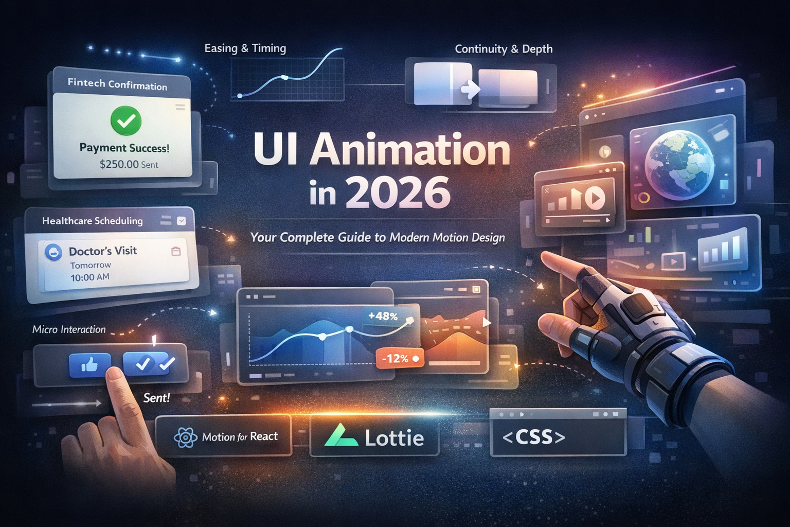

Interaction Design Guide: 5 Micro-Interaction Fails & How to Fix Them.
Interaction design isn’t about adding flair; it’s about reducing friction. Every hover, tap, and swipe is a tiny contract with the user: I see you, and your action mattered. When micro-interactions misfire, they erode usability and make even polished User Interface Design feel clunky.
This guide shows five common micro-interaction fails (with user interface design examples) and exactly how to fix them.
What Micro-Interactions Actually Do (In One Minute)
Think of micro-interactions as digital body language. They typically serve four jobs:
- Feedback — Confirm an action happened (button press → pressed state).
- Guidance — Hint at the next step (drag affordance, directional motion).
- Status — Show progress or change (loading, saving, syncing).
- Delight — Add brand flavor without slowing people down.
Rule of thumb: If motion doesn’t clarify state or reduce uncertainty, it’s a decoration; use it sparingly.
The 5 Micro-Interaction Fails That Frustrate Users
1) Overly Flashy Animations That Interrupt Flow
Looks great in a prototype; great in production. If a menu takes 2 seconds to open, the 10th use feels like a tax.
Fix
Keep most UI transitions 150–300ms; small affordances 100–150ms.
Use functional easing (e.g., ease-out for entering, ease-in for exiting).
Test in loops: if users try to skip or interrupt it, it’s too long.
2) Missing or Delayed Feedback
A tap with no visible response reads as broken. Users double-tap and create duplicate requests.
Fix
Provide immediate press feedback (<100ms): ripple, scale-down, or state change.
For network calls, swap label → spinner + “Submitting…” or optimistic state.
Debounce or disable the control during the request to prevent repeats.
3) Inconsistent Motion Language
If cards slide from the right on one screen and fade on another, users can’t predict outcomes.
Fix
Create a motion style guide: durations, curves, directions, and triggers.
Map spatial meaning to direction (e.g., forward = slide left→right).
Reuse component-level animations; don’t reinvent per screen.
4) Ignoring Accessibility in Micro-Interactions
Relying only on color or motion excludes users with color-vision deficiency or motion sensitivity.
Fix
Always pair color with text/icon/haptic cues for errors and success.
Respect OS settings: implement prefers-reduced-motion fallbacks.
Maintain contrast (WCAG 2.1 AA) and avoid rapid flashing.
5) Micro-Interactions Without Purpose
Flip-spin-bounce for every card load? Fun once, noisy forever.
Fix
Ask: What problem does this motion solve? If none, remove it.
Prioritize discoverability, feedback, and status over spectacle.
Let delight be small and contextual (e.g., easing nuance, micro-icons).
User Interface Design Examples That Get It Right
- Airbnb Heart “Like” — Instant confirmation with a brief burst; no waiting.
- Slack Loading Dots — Branded, calm status that makes load time feel intentional.
- Material Design Ripples — Subtle tap feedback that scales across devices.
Each example improves interaction design by clarifying state, not just adding motion.
A 3-Step Audit to Improve Your Micro-Interactions
Step 1: Watch Real Users
Observe: Do they pause for animations? Double-tap buttons? Miss errors?
Use quick usability sessions or hallway tests on real devices.
Step 2: Measure Efficiency
Review session replays and heatmaps to spot rage-clicks or hesitations.
Shorten any animation linked to hesitation; add or speed up feedback.
Step 3: Build a Micro-Interaction Library
Create reusable components with timings, easing, and accessibility baked in.
Store as a shared Figma page plus Lottie/JSON assets for engineers.
Pro tip: Ship motion tokens (e.g., motion.duration.xs = 120ms, motion.curve.standard = cubic-bezier(...)) so design and code stay in sync.
Common Usability Mistakes to Avoid
- Motion that doesn’t communicate change or state
- Skipping reduce-motion support and text equivalents
- Inconsistent easing/duration across components
- Neglecting performance on mobile/low-end devices
Small lapses add up to broken expectations and dropped sessions.
Conclusion: Interaction Design Respects the User’s Time
Great interaction design is empathy in motion. Get micro-interactions right, and users feel understood; get them wrong,g and they churn before your animation finishes.
Next step: Pick one flow (checkout, sign-in, save) and apply the fixes above. Timebox to an hour; measure the difference.
Further Reading
- Usability Heuristics daily.dev — foundational guidance on feedback and visibility.
- WCAG 2.1 — practical criteria for contrast and motion sensitivity.
- Ripplix's guide to motion tokens or component libraries will be published here once published.
Checklist: Ship-Ready Micro-Interactions
- Press feedback < 100ms
- Transitions 150–300ms with consistent easing
- Optimistic UI or visible loading state
- prefers-reduced-motion respected
- Color + text/icon pairing for state
- Reused component animations from the library
- Tested on low-end devices and high-latency networks
🎨 Level up your motion system. Convert these rules into tokens and a shared Figma/Lottie library, then roll them across your User Interface Design components to boost usability without sacrificing brand personality.