Join
Start Here

What Is UI Animation? Practical Guide for 2026

What is UI animation and why does it matter in modern product design? This practical guide breaks down purposeful motion, real-world benefits, and core principles UI/UX designers need in 2026. Learn how to use animation to guide attention, reduce friction, and create interfaces that feel clear, responsive, and human.

HHasan Bashar
Dec 29, 2025
Share
What Is UI Animation? Practical Guide for 2026

What is UI Animation?

UI animation is purposeful motion that clarifies change, guides attention, and reduces friction in digital products. 

Start simple: animate state changes, give instant feedback (<100ms), and keep transitions short (150–300ms). 

Prototype with Figma’s Smart Animate, test on actual devices, and respect Reduce Motion.

Who this is for

  • UI/UX designers
  • Product designers
  • Front-end developers

You’ll get practical patterns, timings, and a fast Figma workflow so you can ship motion that users actually feel.

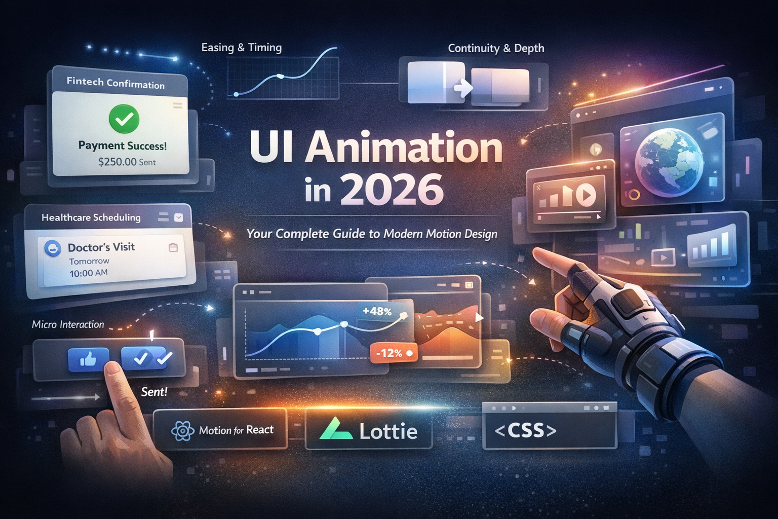
What Is UI Animation (and Why It Matters)

UI animation is the planned movement of interface elements buttons, cards, sheets, toasts, and screens to communicate state, hierarchy, and cause and effect. Good motion is not decoration; it’s part of your product’s language.


Think of it as:

  • Wayfinding: Where did that component go?
  • Feedback: Your action worked.
  • Teaching: Here’s how this feature behaves.
  • Brand voice: This product feels calm/playful/energetic.

Untitled design.jpg 25.4 KB

The Benefits of UI Animation (That Ship Real Value)

  • Boost task completion: Motion shows relationships between states, reducing confusion and backtracking.
  • Reduce perceived wait time: Skeletons, shimmer, and micro-progress make delays feel shorter and controlled.
  • Improve discoverability: Subtle reveals draw attention without shouting.
  • Build brand memory: Consistent easing and timing create a signature feel.
  • Cut support tickets: Clear animated errors (e.g., gentle shake) help users self-correct.


Primary keyword coverage: “what is UI animation”
Secondary keyword coverage:
“benefits of UI animation”

UI Animation Principles with Examples

Use these as a shared checklist across design and engineering.

Purpose Over Pizzazz

 Every animation must answer: What does this help the user understand or accomplish?

 Example: Save button morphs → progress → success check → back to label.

Continuity (Object Constancy)

 Elements should transform from their previous state, not pop into existence.

 Example: Grid card scales and moves from its grid slot into full screen.

Brand voice “This product feels calmplayfulenergetic.jpg 26.96 KB
Timing and Duration

  • Micro-interactions: 150–200ms
  • Component transitions: 200–300ms
  • Full-screen/surface transitions: 300–400ms

 Tip: Hover/focus is snappier than modal entrances. Test timings on target devices.

Easing Curves That Match Physics

Use ease out for entrances, ease-in for exits, and a standard or custom cubic-bezier for most UI moves.

 Example: A material-like curve for natural starts and stops.

Staging and Hierarchy

Animate primary actions first, supporting elements second (40–60ms offset).
 Example: Dialog fades in; then its buttons and fields rise slightly.

Choreography (Group Moves)

Things that belong together move together.
 Example: Filter chips slide in as a cohort, not at random times.

Feedback and Status

Every action should respond within 100ms.
 Example: Immediate tap state (ripple or subtle scale).

Restraint

If everything moves, nothing is important.
 Example: Keep list scrolling plain animate only the sticky header.

Accessibility First

Respect Reduce Motion and provide non-motion alternatives (color, icon, text).
 Example: Replace parallax with instant state updates when reduced motion is on.

Secondary keyword coverage: “ui animation principles with examples”

Core Patterns You’ll Use Weekly

  • Hover/Focus/Tap micro-interactions
  • Navigation transitions (slide, scale, fade)
  • Content reveals (accordions, progressive disclosure)
  • Feedback (loading skeletons, toasts, success/error)
  • Reordering/Drag-and-drop (animated reflow to preserve mental maps)

How to Animate in Figma (Fast)

Figma is the quickest way to prove motion before code.

Step 1 — Wire States

 Create two frames: State A (e.g., card in grid) and State B (card expanded). Keep layer names identical for elements that should morph.

Step 2 — Use Components & Variants

 Turn your card into a Component with Variants (default, expanded). This mirrors how engineers implement states.

Step 3 — Connect with Prototype Links

 In Prototype mode, link the card in A → B (On Click → Navigate To).

Step 4 — Choose Smart Animate

 Set Animation: Smart Animate, Duration: ~250ms, Easing: ease-out. Figma interpolates position, size, opacity, and radii for matching layers.

Step 5 — Stagger with Matching Layers

 Use Smart Animate: Matching Layers to control which elements morph vs. fade.

Step 6 — Add Micro-Interactions

 Inside the component, add On Hover and While Pressed interactions (100–150ms). Keep it snappy.

Secondary keyword coverage: “how to animate in figma”

Smart Animate Figma Tutorial (Hands-On)

Goal: A smooth card → detail transition.

You’ll prepare

  • Two frames: Grid and Details (same viewport)
  • One Card component (image, title, price, hidden description)

Steps

  1. Duplicate the card across both frames; keep layer names consistent.
  2. In Grid, set Description opacity to 0%; in Details, set to 100% and reposition.
  3. Link Card (Grid) → Details with Smart Animate (250–300ms, ease-out).
  4. Add Close in Details; link back to Grid (200–250ms, ease-in).
  5. In Prototype panel, set Smart Animate to match Position, Size, Opacity.
  6. Preview and tweak: entrances slightly slower (confident), exits slightly faster (crisp).

 Pro tip: Increase shadow and slightly reduce corner radius as the card expands to suggest elevation and focus.

Increase shadow and slightly reduce corner radius as the card expands to suggest elevation and focus.jpg 32.25 KB

From Prototype to Production (Dev Handoff Without Code)

  • Motion tokens: Standardize durations (e.g., 150/250/350ms), easings (e.g., ease-in/out + one bezier), and elevation deltas.
  • States & variants: Name them to match components (e.g., Card / Default, Card / Expanded).
  • Platform notes:
  • Accessibility: Provide non-motion cues; honor OS-level Reduce Motion.

Quality Checklist (Before You Ship)

Visual

  • Does the motion explain the change?
  • Durations within 150–400ms?
  • Easing consistent across components?

Product

  • Does motion reduce friction (fewer clicks, less confusion)?
  • Are loading states animated to mask latency?

Accessibility

  • Reduce Motion respected?
  • Critical feedback conveyed via color/icon/text too?

Performance

  • Using opacity/transform (not layout thrash)?
  • 60fps target on mid-range devices?

Common Mistakes (And Quick Fixes)

  • Over-animating everything → Pick 3–5 core patterns and standardize.
  • Inconsistent curves → Define motion tokens (durations + curves).
  • Floaty transitions → Trim 50–100ms; prefer ease-out for entrances.
  • Silent taps → Add immediate press state (<100ms).
  • Ignoring empty/error states → Animate them—they’re part of the journey.

Smart Animate vs. Manual Keyframes (Quick Chooser)

  • Use Smart Animate when: Shape/position/opacity changes, matching layer names, fast prototyping.
  • Use Manual Keyframes when: You need stagger, overshoot, or per-layer timing nuance.
  • Hybrid: Smart Animate for the core morph; keyframes for fine-grained delays and emphasis.

How to Present Animation in Reviews

  • Show State A → State B → State C with a tight narrative: “User taps card → card expands → Close returns them.”
  • Bring your motion tokens (durations, curves) and reference platform notes.
  • Demo with and without Reduce Motion enabled.

FAQ

What is UI animation?
 Purposeful motion that clarifies change, provides feedback, and expresses brand in digital interfaces.

What are the benefits of UI animation?
 Higher engagement, faster task completion, less perceived waiting, better discoverability, and stronger brand recognition.

What are core UI animation principles with examples?
 Continuity (card morphs to detail), timing (micro 150–200ms), easing (ease-out for entrances), staging (dialog then buttons), and feedback (instant press states).

How do I start with Smart Animate in Figma?
 Create two states with matching layer names, link them in Prototype, choose Smart Animate, set 200–300ms, then refine easing.

Any Smart Animate Figma tutorial tips?
 Use components and variants, keep names consistent, and combine Smart Animate with keyframes for subtle stagger.

  • Internal: Explore our motion guidelines and component tokens →
  • External: High-authority motion design overview →

Ready to put this into practice?


Try the Smart Animate flow in your next project, test on a real phone, and iterate with actual taps. Want inspiration and examples to copy? 


Browse more animations on Ripplix and start building a motion system your users will love.

About the Author

Hasan Bashar

I’m a UI/UX designer and product builder focused on crafting meaningful interactions. I built Ripplix to curate real UI animations and micro-interactions from live products—so designers can find the right reference faster and design with confidence.