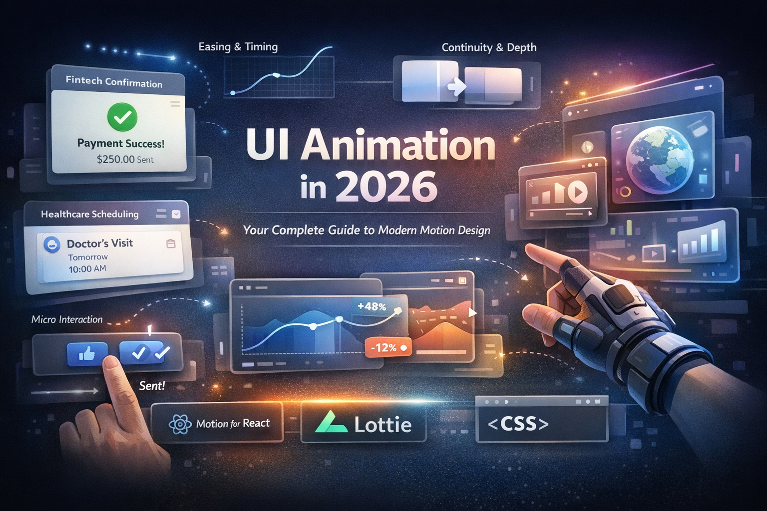
The 12 Principles of Animation UI Design (Applied to Modern Interfaces)
Modern UI animation is more than movement it’s communication.
Disney’s original 12 principles of animation were created for film. However, they have become a secret weapon for modern interface designers. They help creators build UI that feels intuitive, expressive, and deeply human.
In this guide, we’ll translate each principle into practical patterns. You can apply them to your next:
- Figma prototype
- Microinteraction
- Front-end build
Why the 12 Principles Still Matter in UI Design
In UI, animation is not decoration. It’s a visual guide that shows:
- Where something came from
- Where it’s going
- What will happen next
When you apply the 12 principles of animation UI design, you:
- Reduce friction by making state changes obvious
- Guide attention through complex interfaces
- Increase perceived quality and delight
- Support brand personality without sacrificing usability
Think about the last product you used where the motion felt “just right.”
It probably wasn’t just the colors or typography it was how the interface moved.
1. Squash and Stretch UI Design: Making Elements Feel Alive
squash and stretch UI design
In classic animation, squash and stretch gives objects weight and flexibility. In UI, it’s an amazing tool for making interactions feel responsive and alive.
Where to use it:
- Buttons that compress slightly on tap
- Cards that stretch a bit when dragged
- Toggles that bounce into their final state
Imagine a user tapping a “Send” button.
Instead of flipping instantly to a success state, the button dips down 2–3px. It squashes, then returns to normal as the loader appears.
That tiny motion says: 'We registered your tap.
How to implement it:
- Apply a small scale transform (e.g., `scale(0.96)` on press)
- Keep durations short (80–120ms)
- Pair with easing (ease-out on release)
Use it carefully:
Too much squash and stretch can make your product feel cartoonish especially in enterprise or financial tools. Keep it subtle and aligned with brand tone.
2. Anticipation in UI Animation: Preparing the User
Anticipation in UI animation
Anticipation is a small “wind-up” before the main action. In UI, it prepares users for what’s about to happen.
Examples of anticipation in interfaces:
- A sidebar that nudges 2–3px before fully expanding
- A floating action button that lifts up slightly before revealing options
- A button hover that shifts color or lifts just before triggering a menu
This reduces cognitive friction. The user doesn’t just see the result they feel it coming, which builds trust.
How to use it in practice:
- Add a short pre-motion (40–80ms) before a large transition
- Use subtle shifts in scale, position, or opacity
- Keep the anticipation motion in the same direction as the main action (no random wobbles)
3. Staging in UI: Directing Attention with Motion
Staging in UI
Staging is about where the user should look first. In UI, motion is one of your strongest staging tools.
Where staging matters most:
- Onboarding flows
- New feature highlights
- Dialogs and modals
- Navigation transitions in multi-step flows
Example:
When a modal appears, you dim the background, slightly scale up the modal from 0.95 to 1, and keep everything else still. The user knows exactly where to look no guessing.
Techniques for staging in UI:
- Use one primary animated element per moment; keep everything else calm
- Dim or blur background elements during important actions
- Introduce elements sequentially, not all at once, to create a clear reading order
4. Follow Through and Overlapping Action UI
Follow through and overlapping action UI
In reality, things rarely stop instantly. Good UI motion reflects that.
Practical examples:
- A card snap scrolls into place, then child elements settle with a slight delay
- A panel expands, then icons and labels slide in a fraction of a second later
- A menu closes, but shadows fade a moment after the panel disappears
Those tiny offsets add richness and make interactions feel more believable.
How to build overlapping action:
- Stagger animations by 40–120ms between parent and child elements
- Use the same easing curve for related elements to keep motion coherent
- Reserve overlapping action for high-value components (navigation, key CTAs, primary panels) to avoid noise
5. Ease In Ease Out UI Animations: Timing That Feels Human
Ease in ease out UI animations
Ease in and ease out define how motion accelerates and decelerates. Humans expect objects to start and stop gradually; linear motion feels robotic.
Practical guidelines:
- Ease-out for entrances (fast start, gentle stop)
- Ease-in for exits (gentle start, fast finish)
- Ease-in-out for state changes (moving from A to B)
Avoid pure linear unless you want something to feel mechanical (e.g., a progress bar representing a machine process).
Implementation tips:
- Use standard curves like `cubic-bezier(0.4, 0, 0.2, 1)` (Material-style)
- Define easing tokens in your design system (e.g., ease-snappy, ease-gentle)
- Preview easing in your prototyping tool before handing off to devs
6. Arcs in UI Motion: From Robotic to Natural
Straight-line movement often feels stiff. Arcs make motion feel more natural and physical.
UI examples of arcs:
- Floating menu items that fan out on a slight arc from a FAB
- Tooltips that rise along a curve from their anchor
- Drag interactions where components follow a soft path, not pixel-perfect straight lines
You don’t need huge curves just subtle arcs can shift the feeling from mechanical to graceful.
How to design arcs:
- In Figma/AE, use curved motion paths for key components
- Keep arcs shallow for professional products, and bolder for playful brands
- Ensure the arc still respects logical layout (don’t fly across unrelated content)
7. Secondary Action: Adding Clarity and Personality
Secondary action is a supporting motion that reinforces the main interaction without stealing attention.
UI examples:
- A ripple effect after a button press
- An icon that nudges or tilts when a card expands
- A subtle glow or underline that pulses around a selected element
These small touches add clarity (“Yes, something happened”) and personality.
Best practices:
- Make sure the primary action is still the most noticeable motion
- Keep secondary actions shorter and softer (lower opacity, smaller movement)
- Avoid stacking too many secondary actions in one view
8. Timing: The Invisible UX Setting
Timing controls how long animations last, which heavily impacts usability.
Simple timing guidelines:
- Microinteractions (taps, small hovers): 120–200ms
- Panel or drawer transitions: 200–300ms
- Modals or full-screen transitions: 250–350ms
If timing is too slow, users feel blocked. Too fast, and they miss what happened.
How to tune timing:
- Prototype a few variants (e.g., 180ms vs 260ms) and test with teammates
- Slightly speed up animations on high-frequency interactions (like tabs)
- Slow down and soften motion on high-risk actions (like “Delete account”) to give users time to process
9. Exaggeration: Pushing Reality for Readability
Exaggeration boosts clarity, especially in small or dense UIs.
Examples:
- Hover states that make elements slightly larger and brighter
- Toggles that snap briskly into place
- Progress bars that jump or pulse at milestones (50%, 100%)
Exaggeration is especially powerful for playful, youth focused, or creative brands, but even serious products can use it to emphasize critical states.
How to keep it usable:
- Exaggerate just one property at a time (scale, opacity, or color)
- Use it primarily for important events (success, error, progress milestones)
- Test on lower-end devices to ensure exaggerated motions still feel smooth
10. Solid Drawing → Solid Visual Hierarchy in UI
In animation, “solid drawing” is about structure and volume. In UI, this becomes solid layout and hierarchy.
If your hierarchy is unclear, no amount of motion will save the experience.
How to translate this:
- Ensure your layout communicates priority before you add motion
- Anchor animations to logical origin points (e.g., a modal expanding from the button that triggered it)
- Keep shadows, blur, and depth consistent with the direction of motion
Great animation sits on top of a strong visual system. Get the structure right first then animate.
11. Appeal: Motion That Feels Worth Using
Appeal is what makes an interface feel emotionally engaging and inviting.
Building appeal in UI animation:
- Use smooth, consistent easing and timing across the product
- Add small, purposeful microinteractions in high-traffic areas (search, navigation, main CTAs)
- Reflect your brand personality in motion: calm, playful, bold, or minimalist
Appeal isn’t about making everything “cute.” It’s about crafting motion that feels distinct, consistent, and meaningful.
12. Straight Ahead vs Pose-to-Pose in UI Workflows
Straight ahead and pose-to-pose describe animation workflows, and both can apply to UI.
Straight ahead
- Animate freely from start to end
- Great for exploratory prototypes, concept reels, or playful marketing pages
Pose-to-pose
- Define keyframes first (state A → state B)
- Best for product UI, design systems, and coded components
- Feels more stable and predictable
Most production UIs use pose-to-pose. You define key states in Figma, After Effects, or code, then decide how to transition between them with consistent easing and timing.
Bringing It All Together: A 12 Principles of Animation UI Design Checklist
Use this checklist when you’re reviewing a flow, component, or prototype.
For Designers
- Use staging to highlight one primary action at a time.
- Apply squash and stretch subtly to make key components feel responsive.
- Add anticipation and follow through to major transitions (drawers, modals, navigation).
- Tune timing for each interaction type (microinteraction vs. layout change).
- Layer in secondary actions (ripples, icon shifts) for polish without clutter.
- Document easing, timing, and arcs in your design system and handoff specs.
For Developers
- Implement easing tokens (e.g., ease-in-out-brand) and reuse them consistently.
- Use CSS transforms and opacity to keep animations at or near 60fps.
- Keep animations interruptible so users can act quickly (no locked transitions).
- Adjust durations by context don’t use the same 300ms for everything.
- Collaborate with designers to refine timing in the browser or app, not just in prototypes.
Additional Resources
- UI animation or motion design guidelines here.
- Material Design’s motion guidelines or Apple’s Human Interface Guidelines.
The 12 principles of animation UI design give you a timeless foundation for building interfaces that feel smooth, intuitive, and delightful.
Whether you’re animating a single button, designing a checkout flow, or crafting a complex dashboard, these principles help your product communicate more clearly and engage users more deeply.
As a next step, pick two or three principles maybe squash and stretch, anticipation, and easing and apply them intentionally in your next prototype. Watch how quickly your product begins to feel more polished, intentional, and trustworthy.
If you’d like more real-world examples, showcase your interactions on Ripplix, explore other designers’ motion work, and start experimenting in your own components. That’s where these principles move from theory into product magic.